Insight Weeks 3 through 5
Note: This is the second in a series of posts about my Fellowship at Insight Data Science.
In the previous post, I wrote about developing my idea for Airbnb rating predictions during weeks 1 and 2 of Insight. During weeks 3 and 4 I focused on finishing the analysis, making a more polished product, and preparing my presentation. In week 5 we started showing off our work to companies. Even though no software project is ever truly finished, the presentations make a hard deadline for having something good enough to present.
The main problem I had at the end of week 2 was low predictive power; my models were barely performing better than random guessing. Based on the learning curves, I thought I could do better if I had more training examples. I had already collected 4,000 Airbnb listings in San Francisco. To get more was a minor engineering challenge. The Zilyo API I used allows one to specify a search location and search radius. However, I got an out of memory error from the server when I tried to get all of San Francisco’s listings at once. To circumvent that limitation, I reduced the search radius and searched at a grid of points across each city. I used basic geometry to convert kilometers on the Earth’s surface to latitude and longitude, which specify the search grid. It turned out that a search radius of 1 kilometer was nearly optimal for the most densely populated U.S. cities (e.g. New York).
Using this technique I collected data from the top 50 or so U.S. cities by population. At first, I drew a bounding box around each city interactively with Google Maps and created a grid of points within that bounding box. I found that the vast majority of listings came from the central/downtown area of each city. That meant that getting the bounding box to enclose the entire city wasn’t necessary as long as the downtown area was included. After drawing the bounding boxes by hand grew tedious, I found I could get approximate bounding boxes from the Google Geocoding API. With that final refinement, data collection for a new city was effectively automated. With that automation, I was able to collect 70,000 listings in total. An example of the final data collection technique is at https://github.com/ibuder/reputon/blob/master/notebooks/Data_Collection_example.ipynb.
Those additional data gave the biggest accuracy boost of anything I tried. The final learning curve shows the model improving rapidly around 5000 training examples:
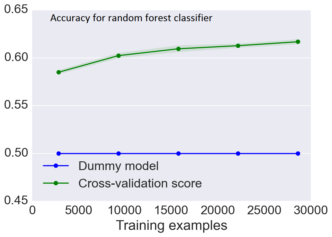
Even after 30,000 examples accuracy is still improving, albeit slowly. You may wonder about the difference between the 70,000 listings I collected and the 29,000 shown in the graph. There are several factors contributing to this difference. First, 22% of the listings are unrated and therefore not used in training. Second, I reserved 25% of the examples for testing. Third and finally, I calculated each point on the learning curve using 3-fold cross-validation so that only ⅔ of the data were available for training. You may also notice that the “dummy model” performs worse in this post than in the previous one. That is an artifact of how I chose to calculate the accuracy. In this post I re-weighted the classes by inverse frequency so random guessing will be correct 50% of the time for a binary classification task.
A second avenue for increasing predictive power was adding features to the model. In this, I benefited from many suggestions for new features from the other Fellows. My initial feature set included anything numerical in the Airbnb listing e.g. number of bathrooms, price, and location (latitude and longitude). My first extensions were to include categorical features. For example, Airbnb indicates hosts’ attitudes towards cancelations as “Flexible,” “Moderate,” “Strict,” “Super Strict,” or “No Refunds.” I used the vectorization trick to turn such categorical data into numerical values. In this example, “Flexible,” “Moderate,” “Strict,” “Super Strict,” and “No Refunds” each became a new feature in my model with a value of 0 or 1 depending on whether each host fell into the corresponding category. Another class of feature I added was related to the length of the room description. For example, I calculated the length of text that hosts added as captions for the room photos. That turned out to be one of the most predictive features of all.
Next, I tried to extract some features based on the actual words hosts used to describe their properties based on a “bag of words” model. I counted the number of occurrences of each word in the listing and used the resulting vector of counts as a new set of features. Somewhat to my surprise, these features did not help accuracy at all. It seems that it doesn’t matter what hosts write, as long as they write a lot. One of the suggestions I got was to instead count the number of misspelled words. I tried that, but it didn’t help either. Because these features didn’t improve accuracy and were expensive to calculate, I’ve removed them from the model for now. In the future I’d like to investigate more whether anything in the description text correlates with ratings.
In the end, location and length of description were the most important features: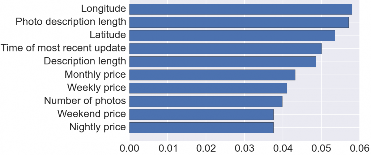
For each feature, I calculated the importance by averaging how often that feature was used to make a decision in the random forest. For the technically inclined, this importance is based on Gini impurity. Three of the top ten features were length-like: photo description length, [main text] description length, and number of photos. My hypothesis is that hosts who put long descriptions about their rooms are more attentive and, therefore, more likely to give guests a good experience. Four of the top features were price (for different stay lengths); all of these were highly correlated. Higher prices correlated with better ratings. I think this is the effect of nicer rooms (larger, more amenities, better furnishings, etc.). Finally, two of the top features were longitude and latitude. Somewhat to my surprise, the effect of location turned out to be hyper-local:
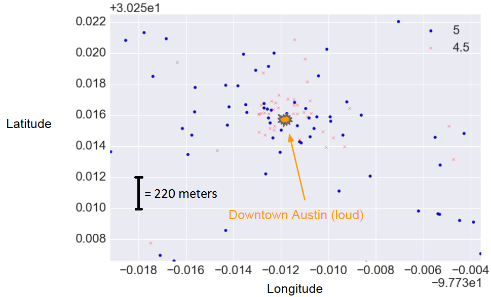
In this example, the negative ratings were much more concentrated in the center of downtown Austin, TX. When I looked at the actual guest reviews, most complained about the loud noise in that part of the city. I looked for some data I could use as a loudness feature and found http://howloud.net/, a startup that’s trying to give every location a “Soundscore.” Unfortunately, it only works in Los Angeles so far.
You can try making some rating predictions yourself at http://reputon.immanuelbuder.net/ (available for a limited time). The web app is mostly Flask, with Bootstrap to provide a responsive template. One of the suggestions I got from previous Fellows was to include single-click buttons for examples. In the stress of a presentation, it’s surprisingly difficult to operate even a simple web app. I used http://embed.ly/ and some AJAX to create the Airbnb listing preview. The preview isn’t critical for interpreting the prediction, so I didn’t want it blocking the first page render.
In the last part of Insight, Fellows show off their projects to mentor companies at which the Fellows are interested in interviewing. Probably the most difficult challenge for me was condensing the actual work process of trial and error into a linear story that focused on successes while also explaining how I arrived at the final product. From the Fellows’ point of view, these demos are a great way to learn more about the companies in an environment that’s not quite as stressful as an interview.
Officially, Insight is a seven-week program, but they don’t just abandon you after seven weeks are over. Usually interviews continue for several weeks (or months) after the nominal program ends, and Insight continues to work with Fellows on interview preparation and company matching. All in all, it’s been a long transition (I started thinking about doing this more than a year ago), but I’m very happy I did and am looking forward to an exciting role in industry.
- Log in to post comments